Rozel & Co
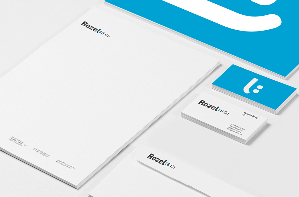
Brand architecture, stationary, websiste look & feel
The point at which creativity and entertainment meet technology and business is where Rozel can be found. Rozel & Co as a company are the innovators which connect businesses with technology, commerce and creativity.
When I started working with Rozel & Co, my ideas for the design fell into two categories of strategy.
First of all – Launch. Launching an emotionally positive message that connects with the user and communicates the three key values of proximity, creativity and technology.
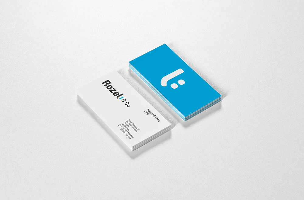
To turn these concepts into a visual design, we’ve taken the shape of the letter ‘I’ and transformed it into a pop up icon which invokes similarities to the modern day smiley, friendly face. The link between the ‘I’ design and the shape not only remind us of connections and of positive vibes, but of the origins of computing and technology – specifically the C:\MS.
Secondly – Visuals. To create a visual system which allows us to easily create sub-brands which perform well under the umbrella of the Rozel & Co brand


